This post is my contribution to the challenge set up by Ari Lamstein. I wish I had more time to spend on it, but it did at least give me the opportunity to learn to use dplyr, reshape2, ggplot, Shiny, and the choroplethr package. I’m also making heavy use of rvest, which I have explored already in some of my previous posts.
This post is divided in three sections. First, using ggplot, we chart a time view of the race, for both parties. Then we use the choroplethr package to try and display the performance of the candidates in relation to a demographic variable. Finally, a simple Shiny app provides us another way to visualize and slice through the data.
Excited ? Let’s get started !
Section 1: Time view of the race
I’ve decided not to explicitely show the code in this post, but if you are interested, you can find the complete code for this section here. Should you have any questions or comments, don’t hesitate to leave them below.
My data is scraped from: http://www.politico.com/2016-election/results/map/president. At the time of writing of this post, the website contained election results up to April 9th.
So, here’s how the race is shaping up so far for the republican party:
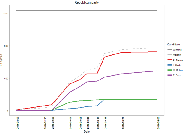
The grey solid horizontal line is the finish line: it’s the number of pledged delegates a candidate must have in order to be declared the winner (in theory – that is, assuming the pledged candidates don’t change their minds !). The dashed grey line represents 50% of the running total number of delegates: it’s a way to quickly visualize how well the leading candidate (in this case Trump) is doing compared to where he needs to be come the end of the race.
An important observation here is that the red line is below the dashed grey line, which means that even though he is way ahead of his main rival, Trump still needs to pick up the pace if he wants a guaranteed win. And it is a secret for noone that if he doesn’t get the guaranteed win, he is toast. Which is why you’ll often hear Trump say that Kasich should quit, because he actually needs those votes.
Compare this to the picture in the democratic party:
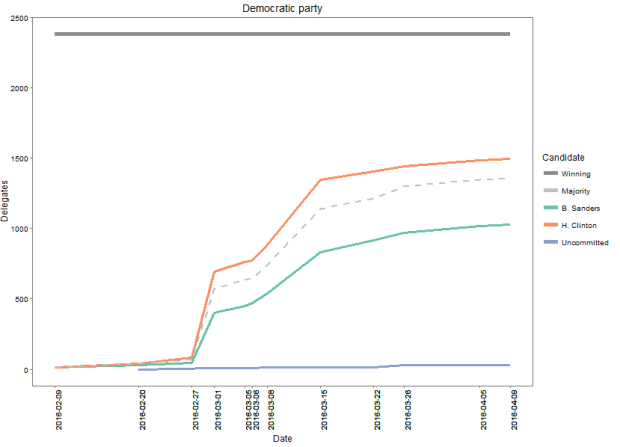
Here you can see that not only does Clinton have a comfortable lead over her opponent, she is also well poised to have the majority by the end of the race, if the trend continues.
Section 2: Map view
We now turn our attention to the county-by-county election results. In this section we will focus on the two leading candidates for each party: Clinton and Sanders for the Democrats, Trump and Cruz for the Republican. We will be counting the votes this time (instead of the delegate counts).
For this purpose, I have normalized the vote counts to be as if only the two leading candidates were competing (so that their combined vote percentages would sum to 1). This does introduce some bias in the results, but it is an easy and reasonable way to deal with the fact that the number of candidates changed through time due to some candidates dropping from the race.
I tried scraping the same website as in section 1 (you can click on the Detailed Results link to get the county results)…unsucessfully, because the page content is dynamically generated via javascript.
So I resorted to:
- manually scrolling down the page to force-generate the html
- saving the html code (thanks to google inspector) to my hardrive
- scraping the the code locally with rvest
I’ve copied all the files (each file corresponds to a state) on google drive. Please note (if you want to run the code), that the files must be in a “states” subfolder of your working directory.
Also note that I haven’t used the results of Kansas and Minesotta…because they are by district instead of by county, and I couldn’t find a decent mapping between the two (if you do, please let me know!).
After that, I used the choroplethr package to download us census data (5 years, as of 2013). It is ridiculously easy. If you interested in knowing more, Ari has written a tutorial just for that.
A few mutate, filter, dcast and melt later, I had my desired results: a number of votes by state, county and candidate, merged with the us census demographics data. If you are interested in playing with this dataset, I am also making it available here.
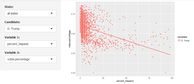
I was particularly interested in the relationship between Trump’s popularity and the proportion of the Hispanic population in a given county.
In the map below, I have used hue to represent the popularity of Trump: counties where he was more popular (his vote percentage is higher than his median country-wide) are in green, counties where he is less popular are in purple.
The same idea was applied to the Hispanic population percentage, using saturation this time: a saturated color for counties with a percentage of Hispanics in the top 50%, and a pale color for the others.
And here is the result:
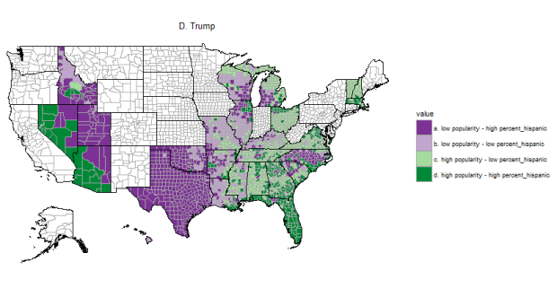
Based on this, would you say that Trump is unpopular among Hispanics ? I guess it depends ! Looking for example at Florida and Texas, which both have most counties in the top 50% when it comes to percent Hispanic, one could say that the Hispanics of Florida love Trump, while those of Texas, not so much…could it have something to do with the infamous Mexican wall…
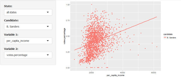
Another relationship I was curious about is that between Sander’s popularity and the per capita income in a county:
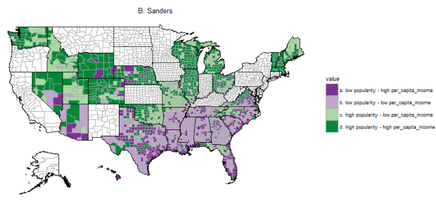
Here the relationship is pretty obvious! A lot of saturated green, and a lot of pale purple, as well as a clear north/south division. Sanders is popular in the North and North-West, and in top-50% counties with regards to per-capita income.
If you’re interested, you can easily map other relationships. Get the code here.
The function call is as easy as:
plot_map("B. Sanders&", "per_capita_income")
Section 3: Shiny
In this section, I wanted to be able to slice through the data to get an overall feel of how well a candidate is doing regarding a particular demographics. Where as in the preceding section we could quickly see the difference between states, here the focus is more on the demographics variable.
You can find the app here, and the code here.
For example, let us take a second look at the relationship between Trump’s popularity and the proportion of hispanic population:
What about Sanders and per capita income:
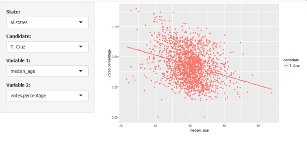
And, just for fun, Ted Cruz with median age:
Finally, let us look at all candidates, with the percentage of black population:
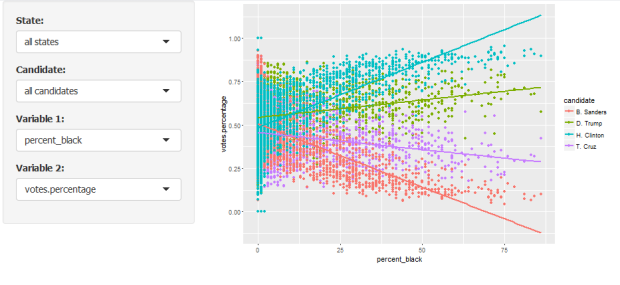
Whoa! The difference between Clinton and Sanders there is astonishing!
That’s it for today, I hope you enjoy this post, and that you will have fun playing with the Shiny app.

Great job!
LikeLiked by 1 person
So far this is actually the best of the results I’ve seen. Because not only is it good, but it uses a nice array of tools to create a convincing and polished result, and makes current issues hum with the beauty of R. And it’s well-written in an engaging style. Looking forward to reading this blog on a regular basis and sending it off to everyone I know. You really kicked the stuffing out of this theme with R; magnificent. Good points, well-made. Steady on!
LikeLiked by 1 person
@MonkeyKing, I couldn’t thank you enough for your kind comments…(you actually have no idea how well timed they are…). Thank you !!!
LikeLike